Every Brea(d)th You Take: Market Concentration Risks

A public service announcement to individual investors: Unlike institutional fund managers, individuals typically do not benchmark their performance directly against the S&P 500. Most individual investors are (or should be) focused on investing for longer-term personal goals—retirement, education, cash flow, etc.—rather than trying to match or beat a specific index each quarter. High concentration—i.e., overweighting a small handful of mega-cap tech and tech-adjacent companies—does carry upside risk if the stocks perform well, but commensurate downside risks if they falter.
Record-breaking concentration
As shown below, the largest 10 companies in the S&P 500 together account for 40% of the index's market capitalization, with the top five representing about 27%. These are well above the peaks reached in 2000, when the dot com bust was getting started.
Toppy weights
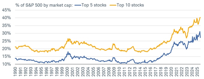
Source: Charles Schwab, Bloomberg, as of 8/31/2025.
. Indexes are unmanaged, do not incur management fees, costs and expenses and cannot be invested in directly. Past performance is no guarantee of future results.
Impact anything but passive
High concentration can magnify both opportunities and risks. The share of exchange-traded funds (ETFs) and mutual funds that employ passive strategies is currently 54%, although the growth rate of active strategies within the ETF space is higher due to active's lower base. Passive index funds, which mirror the weightings of benchmark indexes, become especially exposed to downside risks in a high concentration environment. Portfolio diversification can thus be undermined by systemic over-reliance on a handful of dominant companies.
Misperceptions abound on this topic per the many conversations we have with investors each week. Investors often conflate price performance and contribution to index returns. A version of the table below finds its way on my (Liz Ann's) X feed every morning. It shows the ever-popular Magnificent 7 (Mag7) stocks, alongside both the S&P 500 and Nasdaq indexes. The first column shows year-to-date performance, ranked in descending order. As shown, three of the Mag7 are actually underperforming both indexes this year.
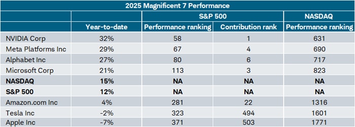
Source: Charles Schwab, Bloomberg, as of 9/12/25.
All corporate names and market data shown above are for illustrative purposes only and are not a recommendation, offer to sell, or a solicitation of an offer to buy any security. Indexes are unmanaged, do not incur management fees, costs and expenses and cannot be invested in directly. Past performance is no guarantee of future results.
From a price-performance perspective, the disconnect is glaring. The best performing Mag7 stock year-to-date is NVIDIA, but there are 57 stocks in the S&P 500 outperforming it. In the case of the Nasdaq, it's not just glaring…it's a WOW. There are 630 stocks in that index that are outperforming the best of the Mag7. In other words, there is a perception that these stocks are top performers; when in fact they are among the largest contributors to index performance by virtue of their size (price performance x weight in the index = contribution).
We do not have access to the contribution rank for the Nasdaq, but as shown in the table above, NVIDIA is only ranked #58 from a price performance standpoint, even though it's ranked #1 in terms of its contribution to S&P 500 index returns. Conversely, Apple is "only" down 7% year-to-date, but its contribution ranking is #503! (There are actually more than 500 stocks in the S&P 500 given that two companies—Alphabet and Berkshire Hathaway—each has two classes of shares.)
No participation trophy
Another way to highlight the contribution paradox is shown below. Both the S&P 500 and Nasdaq are trading at all-time highs. However, the share of stocks within those indexes that are trading at new 52-week highs is a relatively paltry 4.6% for the S&P 500 and 3.5% for the Nasdaq. Contrast that to late 2024 when the indexes were rising, but so was the share of stocks trading at 52-week highs.
Minimal participation
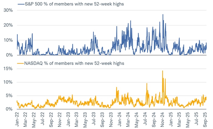
Source: Charles Schwab, Bloomberg, as of 9/12/2025.
Indexes are unmanaged, do not incur management fees, costs and expenses and cannot be invested in directly. Past performance does not guarantee future results.
Speaking of tech-heavy, there is a perception that technology stocks are the primary drivers of the overall Nasdaq's performance from a price-appreciation perspective. That is not always the case, including this year. Whereas 13 of the best 25 performers within the S&P 500 are in the Technology sector, only two of the best 25 performers within the Nasdaq are in the Technology sector. The sector most represented by the best 25 performers within the Nasdaq are actually Consumer Discretionary (eight stocks) and Health Care (five stocks). (AI hat tip: for investors without access to systems like Bloomberg, ChatGPT can provide a list of the best performers in each index, with the obvious disclosure that "past performance is no guarantee of future results.")
You've got to earn it
A question we often receive these days is how stocks have been able to recover so swiftly from the April 8th lows—and with relatively little volatility. At the most fundamental level, actual fundamentals are the simplest support we can point to. In the depths of the early April drawdown, we saw a spike in the number of companies withdrawing earnings guidance or cutting estimates for the year. After a series of tariff pauses and delays, companies regained confidence and many reinstated guidance.
The short timespan in which that guidance head fake occurred meant there was little—if any—disruption in forward earnings estimates. As shown below, there was a bit of a stumble in forward 12-month earnings-per-share (EPS) estimates for the S&P 500, but it was brief. Forward EPS have risen to an all-time high, supporting the market's rally and, all else equal, helping put downward pressure on the market's multiple. It's been a different story for the S&P 600, which, like the Russell 2000, tracks U.S. small caps. Importantly, though, it has a quality filter for metrics like earnings, which means it's a better index to look at when it comes to EPS and price-to-earnings ratio (P/E) analysis. Forward EPS for the S&P 600 have risen of late but unlike the S&P 500, they have yet to reach a record high, which helps explain small caps' serial underperformance for the past several years.
Large-cap EPS dominance
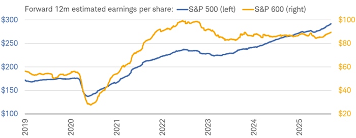
Source: Charles Schwab, Bloomberg, as of 9/12/2025.
Forecasts contained herein are for illustrative purposes only, may be based upon proprietary research and are developed through analysis of historical public data. Indexes are unmanaged, do not incur management fees, costs and expenses and cannot be invested in directly. Past performance does not guarantee future results.
The underperformance of small caps is also being propelled by the fact that U.S. mega caps keep getting larger. In fact, as shown in the chart below by our friends at Ned Davis Research (NDR), the Mag 7 group of stocks makes up nearly 34% of the S&P 500's market cap. In level terms, that is an eye-popping statistic, but it's even more incredible when considering that the Mag 7's weight was just slightly more than 10% a decade ago.
Key to keep in mind in the bottom panel of the chart is that the growth in the Mag 7's dominance hasn't been unjustified. As that small group of stocks' market cap share has grown, so has its EPS share. Of course, the percentages are not the same, but direction matters just as much, if not more, than level here. A prime example is 2021, when the Mag 7's market cap share grew and diverged from its EPS share. Ultimately that negative divergence was corrected in 2022, when the mega caps led the S&P 500's bear market. Memories are sometimes short: there are times when the largest stocks are the worst performers relative to the index.
Mag 7's influence growing
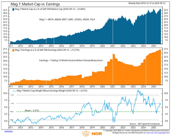
Source: Ned Davis Research, as of 9/12/2025.
All corporate names and market data shown above are for illustrative purposes only and are not a recommendation, offer to sell, or a solicitation of an offer to buy any security.
In sum
With the top handful of stocks in the S&P 500 accounting for an historically high share of total market capitalization and index returns, investors face a risk that market breadth narrows and performance becomes overly dependent on a few dominant stocks. This dynamic can distort perceptions of market health, as index gains may mask underlying weakness among the majority of constituents. For individual investors, the risk is that portfolios tied closely to cap-weighted indexes become more vulnerable to company-specific or sector-specific shocks, reducing the benefits of diversification that broad equity exposure is meant to provide.
About the authors

Liz Ann Sonders